

Appearance & Styling
Styling without CSS
The Appearance tab lets you match the directory to your site’s look without touching a stylesheet. You’ll find it under Integrations > Settings, and it has its own Save button separate from the Settings and Call to Action forms — make your changes here, then click Save on this tab.
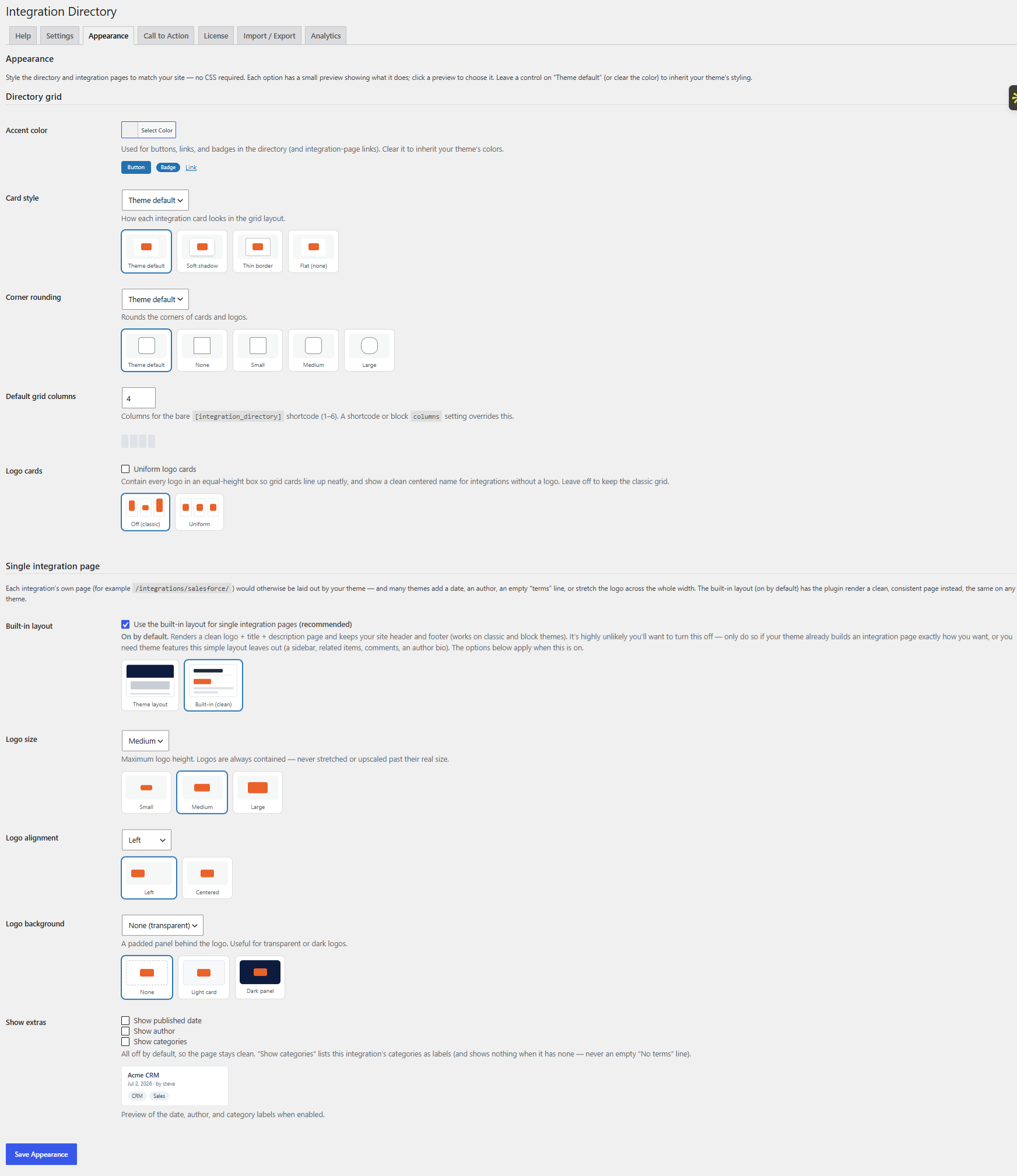
The most important thing to know first: every control defaults to Theme default (and the accent color starts blank). That is a true no-op. Until you change something, the plugin emits no CSS at all and the directory simply inherits your theme. When you do set an option, the styles it emits are scoped to the directory only — they won’t leak out and restyle the rest of your site. There are no developer filters here; everything is driven by these four controls.
The four controls
Accent color
A standard WordPress color picker (hex values only). The accent color applies to buttons, links, and badges across the directory. Clear the field to inherit your theme’s own colors again — a blank value is the no-op default.
Heads up: the accent color drives your buttons, links, and badges, so choose a shade with enough contrast against the text and background around it. A very pale accent can leave those elements hard to read; if they look washed out, pick a deeper shade.
Card style
Choose how the cards look: Theme default, Soft shadow, Thin border, or Flat. This control only affects the grid layout’s cards — it has no effect on the list or compact layouts. Note that both Soft shadow and Thin border force a white card background so the shadow or border reads cleanly; Flat and Theme default leave the background to your theme.
Corner rounding
Sets how rounded the corners are: Theme default, None, Small (4px), Medium (8px), or Large (16px). Rounding applies to the grid cards and to the integration logos, so you can soften both in one setting.
Default grid columns
Sets how many columns the grid uses (1 to 6, default 4) for a bare shortcode — that is, one placed without its own columns value. This is only a default: a columns value on the shortcode or the block, or a ?columns= URL parameter, overrides it for that placement. And regardless of the number you set, mobile still drops to 2 columns on narrow screens.
Related articles
- Shortcode Options — the
columnsattribute and the rest of the[integration_directory]options that override these appearance defaults. - Building an Integration — setting an integration’s logo, which corner rounding also affects.